In the ever-evolving world of ecommerce, standing out isn’t just a goal—it’s a necessity. As a business or an entrepreneur looking to improve your ecommerce game, finding inspiration from the best websites is crucial. From stunning designs to seamless user experiences and innovative technologies, some websites go above and beyond, leaving you both impressed and inspired. But with so many options, where should you turn for the best ideas?
In this blog, we’ll explore five ecommerce websites that are not only beautiful but also functional and highly engaging. Whether you’re designing a new website or refreshing an existing one, you’ll find plenty of valuable takeaways. Ready to get inspired? But before, it would be great knowing what e-commerce is.
How Do We Choose These Top Ecommerce Sites?
When you look at successful ecommerce websites, you’re seeing the result of careful design, well-thought-out customer journeys, and smart marketing strategies. But what exactly makes a website “great”? The criteria we used to rank these e-commerce sites include:
- User experience (UX): A great ecommerce site makes it easy for visitors to find what they want. Navigation, layout, and checkout should all flow smoothly.
- Visual design: First impressions matter. If a website looks dated or cluttered, users are likely to leave before they even explore your offerings.
- Mobile responsiveness: At any given year, your e-commerce website should work seamlessly on any device, from desktops to smartphones.
- Site performance: Speed is a non-negotiable factor. Users expect quick-loading pages—anything more than a few seconds can lead to frustration and lost sales.
- Innovative features: We love websites that aren’t afraid to push boundaries. Whether it’s cutting-edge technology, creative use of content, or unique interactive elements, we give extra points for boldness.
What Makes a Great E-commerce Website?
Before diving into the specific examples, let’s break down what separates good ecommerce websites from truly great ones:
- Clear Branding: Your website should reflect your brand’s personality. Everything from the logo to the color scheme should reinforce who you are.
- Simple, Intuitive Navigation: Don’t make users dig through multiple menus to find what they need. Keep navigation intuitive, with clear categories and logical site structure.
- High-Quality Images and Videos: Visual content can make or break an ecommerce website. Professional, high-resolution product images and engaging videos add credibility and appeal.
- Persuasive Copywriting: Great ecommerce websites don’t just showcase products; they tell a story that motivates visitors to buy. Invest in copy that highlights benefits, addresses pain points, and creates urgency.
- Optimized for Conversions: Whether it’s simple checkout processes, limited-time offers, or well-placed call-to-action (CTA) buttons, the best ecommerce sites are built to convert.
With that understanding in mind, let’s look at the top five ecommerce websites that are excelling in all these aspects.
Top Five Best Ecommerce Websites

1. Easyplant
If you’re tired of struggling to keep houseplants alive, Easyplant has created an ideal solution for plant lovers of all levels, especially beginners. The brand is built around the concept of “easy-to-care-for plants” that practically take care of themselves. Designed for busy people who might not have time for intricate plant care routines, Easyplant’s promise of self-watering pots and plants that thrive with minimal effort is a game-changer in the ecommerce plant niche.
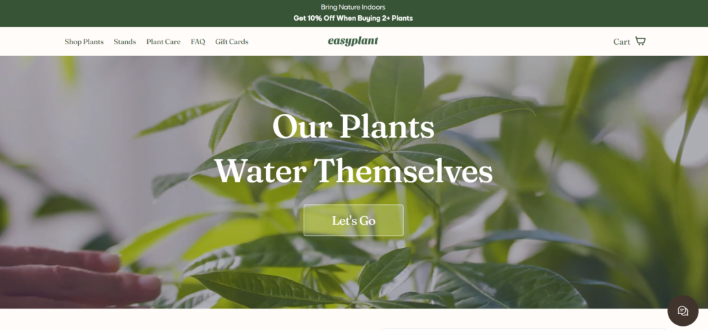
When you first land on their site, you’re greeted with an incredibly user-friendly interface, showcasing a sleek and modern design that mirrors the simplicity of their product. From beautifully photographed plants to easy navigation, every element on the website is designed to make plant shopping as hassle-free as possible. Easyplant understands that its customers are likely people who appreciate beauty but are also strapped for time, which is why their product descriptions highlight convenience, aesthetics, and sustainability all at once. This focus on the customer’s needs is reflected in every part of their design, from the filter options to the easy checkout process.
Website’s summary:
- Stunning Visuals: High-quality product photography is front and center. Each plant is shown in multiple angles, set against minimalist backdrops that allow the products to shine.
- Simple Navigation: The site makes it easy for you to find plants based on your needs—whether you’re shopping for a specific size, light requirement, or style.
- Engaging Copy: Easyplant has excellent product descriptions that do more than just explain. The copy highlights the benefits of owning a low-maintenance plant, addressing customer pain points like lack of time or a “black thumb.”
- Sustainability Focus: Sustainability is a growing concern for shoppers, and easyplant taps into that with eco-friendly packaging and plant care instructions that minimize water usage.
Takeaway: Easyplant teaches us that ecommerce websites don’t need to be complex to be effective. In fact, a streamlined, simple design focused on the product’s unique selling points can make the shopping experience far more enjoyable and stress-free.
2. Yoox
Yoox is a leader in the fashion ecommerce world, known for offering a vast collection of luxury goods, designer apparel, and exclusive collaborations. What sets Yoox apart is its ability to seamlessly merge fashion and technology in a way that appeals to both style-conscious consumers and tech-savvy shoppers. With Yoox, you don’t just browse products—you get a fully personalized experience that feels like having a personal shopper right at your fingertips.
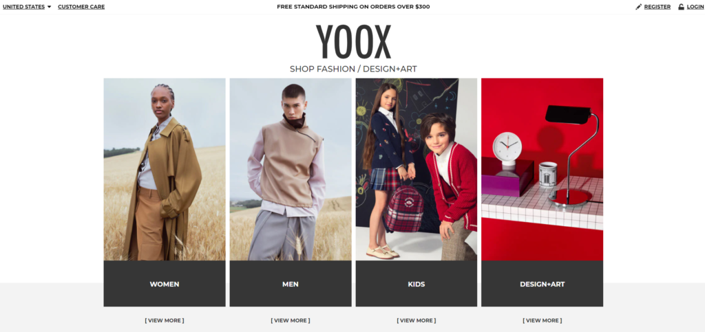
As soon as you land on the website, the clean, minimalistic layout draws you in, making it easy to find what you’re looking for without being overwhelmed by clutter. Yoox’s curated collections, bold product photography, and editorial-style content give it an edge over typical ecommerce platforms. By using artificial intelligence (AI) to tailor product recommendations based on your browsing habits, Yoox creates an individualized shopping experience that keeps users coming back for more. The brand’s commitment to innovation is further evident in its mobile app, which enhances the shopping experience with features like image recognition, enabling you to find similar products by simply uploading a photo.
Website’s summary:
- Visual Appeal: From avant-garde fashion to luxury items, Yoox’s design perfectly matches its audience. Clean lines and bold photography draw you in, while the sleek design ensures you’re not distracted from the products.
- AI-Powered Personalization: The site uses machine learning algorithms to recommend products based on your past browsing behavior, making the shopping experience highly personalized.
- Seamless User Experience: Yoox has nailed the balance between offering vast product options and maintaining a streamlined, easy-to-navigate interface. Whether you’re looking for the latest in fashion or designer items, you can find everything with just a few clicks.
- Global Focus: With customers from across the world, Yoox ensures that its website is localized, with currency conversion and region-specific content tailored to make the shopping process as smooth as possible.
Takeaway: Yoox shows how investing in technology, especially AI and personalization, can dramatically enhance the user experience. It’s a prime example of how to leverage cutting-edge tools to stand out in a highly competitive industry.
3. Makearchitects
At first glance, Make Architects might not seem like a typical ecommerce site. However, this renowned architecture firm has built a website that serves as a powerful tool for showcasing its services in a way that feels immersive and engaging—much like an ecommerce platform. Make Architects has managed to create an online presence that not only highlights its portfolio but also offers a deep dive into the creative process behind its projects.

The moment you enter their site, you’re met with striking visuals and interactive elements that invite you to explore their work in great detail. Each project is presented as an immersive experience, with in-depth descriptions, high-resolution imagery, and even interactive 3D models that allow you to view the designs from multiple angles. Unlike most service-based websites, Make Architects offers a rich content experience that educates visitors about their architectural philosophy, sustainability efforts, and the unique challenges of each project. The intuitive navigation ensures that whether you’re a potential client or simply an admirer of architecture, you’ll find it easy to navigate the vast range of projects and services they offer.
Website’s summary:
- Creative Layout: The website uses an unconventional layout that mirrors their architectural style. Each page feels like a new experience, reflecting the brand’s innovative approach.
- Interactive Elements: Make Architects incorporates interactive elements like project walk-throughs and 3D models, which not only showcase their work but also provide a highly engaging user experience.
- Content-Rich Experience: With in-depth articles, case studies, and video content, the site does an amazing job of positioning the brand as an authority in its field.
- Calls to Action (CTAs): The CTAs across the site are subtle yet effective, encouraging users to explore projects, download case studies, or schedule a consultation without feeling pressured.
Takeaway: MakeArchitects demonstrates that even service-oriented businesses can learn from ecommerce strategies. A well-designed, content-rich website can help you stand out and engage with clients in ways that go beyond a traditional portfolio presentation.
4. Nike
Nike is not just a brand—it’s a lifestyle. As one of the world’s largest sports apparel and footwear companies, Nike has built an ecommerce platform that reflects the same level of excellence and innovation as its products. Their website isn’t just about selling; it’s about inspiring. Nike leverages its ecommerce site as a storytelling tool, highlighting not only the products but the athletes, movements, and cultures that embody its brand.
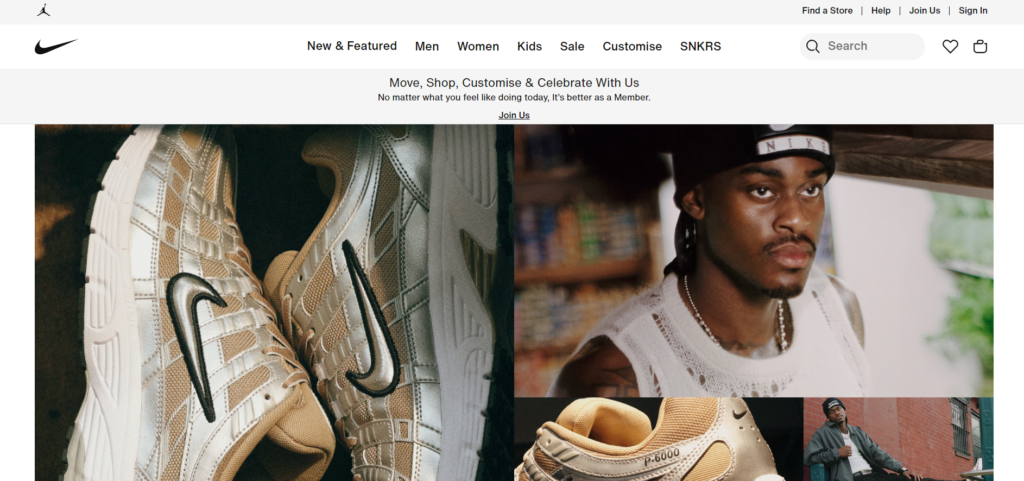
The site’s homepage is a dynamic showcase of Nike’s latest campaigns, new product releases, and collaborations with athletes and designers. It’s impossible to visit without feeling energized and inspired by the brand’s bold visuals and engaging content. Nike’s ecommerce site seamlessly blends its products with powerful stories of performance and empowerment, making you feel like you’re part of a larger community. Whether it’s the innovative product filters that help you find exactly what you need or the customizable options that let you personalize your gear, Nike’s website ensures a smooth, engaging, and fun shopping experience. And with their top-tier mobile app, they’ve also ensured that this experience translates perfectly to any device.
Website’s summary:
- Immersive Storytelling: Nike’s website is more than just a store—it tells stories. Whether it’s highlighting the latest athletic innovation or showcasing inspiring athletes, the content is always compelling.
- Personalization: Nike leverages its customer data to offer a highly personalized shopping experience. From product recommendations to targeted campaigns, the website adapts to your needs.
- Smooth Checkout: Their checkout process is one of the fastest and smoothest around. With options like Apple Pay, PayPal, and one-click purchasing, Nike ensures minimal friction in the buying process.
- Community Focus: The website is not just about products; it’s about community. You can find workout routines, upcoming events, and access to exclusive content as part of the Nike family.
Takeaway: Nike’s ability to blend storytelling, community building, and ecommerce is what truly sets it apart. The website not only sells products but also immerses visitors in the brand experience, showing how ecommerce can be much more than just transactional.
5. Buffy.co
As a relatively new player in the direct-to-consumer space, Buffy has quickly become one of the most talked-about brands in the home goods industry, particularly in the eco-friendly bedding market. Buffy’s ecommerce site exemplifies how brands can use their online presence to promote not only their products but also their values. With a focus on sustainability, Buffy’s entire website reinforces the brand’s commitment to being environmentally responsible while also offering consumers luxurious comfort.
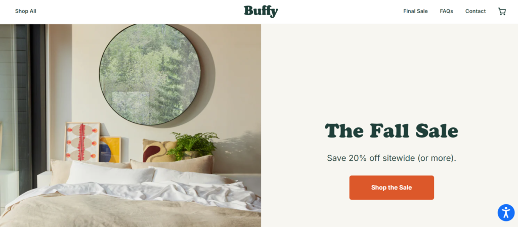
From the moment you land on the homepage, it’s clear that Buffy is all about sustainability and transparency. Every product page provides detailed information about the materials used, the environmental impact of production, and the company’s goals for reducing its carbon footprint. What makes Buffy stand out is its ability to communicate these values without overwhelming the user—everything is presented in a friendly, approachable way. The site also offers innovative features like a personalized bedding quiz, which helps guide users toward the best products for their specific needs, making the shopping experience more customized and user-friendly. The design is clean, visually appealing, and emphasizes comfort, much like the products themselves.
Website’s summary:
- Eco-Friendly Messaging: Buffy’s entire website revolves around sustainability. From recycled materials to their commitment to carbon neutrality, everything about the site reinforces the brand’s green credentials.
- Customer-Centric Design: Buffy makes it easy for you to find the perfect bedding. With a quiz that guides you toward the ideal product based on your preferences, the website feels more like a personalized shopping assistant than a store.
- Transparency: Buffy doesn’t shy away from showing exactly where their products come from and the environmental impact of their production. This transparency helps build trust with eco-conscious consumers.
- Visual Storytelling: Stunning visuals, coupled with compelling product descriptions, make it clear that Buffy is as much about comfort as it is about sustainability.
Takeaway: Buffy’s focus on sustainability, transparency, and customer-centric features makes it a standout ecommerce platform. The site shows how aligning your brand values with your website’s design and messaging can create a deeper connection with customers.
Conclusion
The five websites we’ve explored—Easyplant, Yoox, Make Architects, Nike, and Buffy—each excel in different aspects of ecommerce. Whether it’s through innovative use of technology, stunning design, or compelling storytelling, these sites provide inspiration for anyone looking to elevate their online store.
If you want to create an ecommerce platform that not only looks great but also converts, take cues from these industry leaders. Focus on user experience, mobile optimization, personalization, and brand storytelling. And most importantly, keep innovating!

